CRISTINA CELESTINO
EXCLUSIVE INTERVIEW WITH THE MILAN-BASED ARCHITECT + DESIGNER.
This week we are honoured to be in conversation with Cristina Celestino, who is an exceptionally talented architect and designer, with an impressively diverse repertoire of projects and designs. In 2005, Cristina graduated from the prestigious School of Architecture at IUAV University of Venice. Following her studies, she worked for a number of high profile interior architecture and design studios. In 2009, she moved to Milan and just two years later she established her own brand Attico Design. By 2013, Cristina had set up her own eponymous design studio and since then she has won numerous accolades, as well as gaining a high-profile extensive list of clients and collaborations to her name.
Cristina Celestino for Maison Matisse
Photo | Chiara Cadeddu
How do you define design and what does it mean to you?
CC: Design is the right and aesthetically well done shape where art, culture, technology meet and mix in an unexceptionable way. It is my job and my passion, and I have a great respect for all the world that works with it (craftsmen, factories, suppliers, brands, press, commercial workers and so on..).
What’s your personal philosophy that guides your creative profession?
CC: My work is based on observation and research. My projects are driven by an in-depth exploration of the potential of forms and functions, where there are historical and contemporary references to the worlds of fashion, art and design. I would say that the fil rouge of my creations is clear, rigorous use of geometry, in a process of careful manipulation of traditional forms. Often, my products also feature variations of scale and brilliant little inventions, playing with conventional messages and hidden, unexpected meanings.
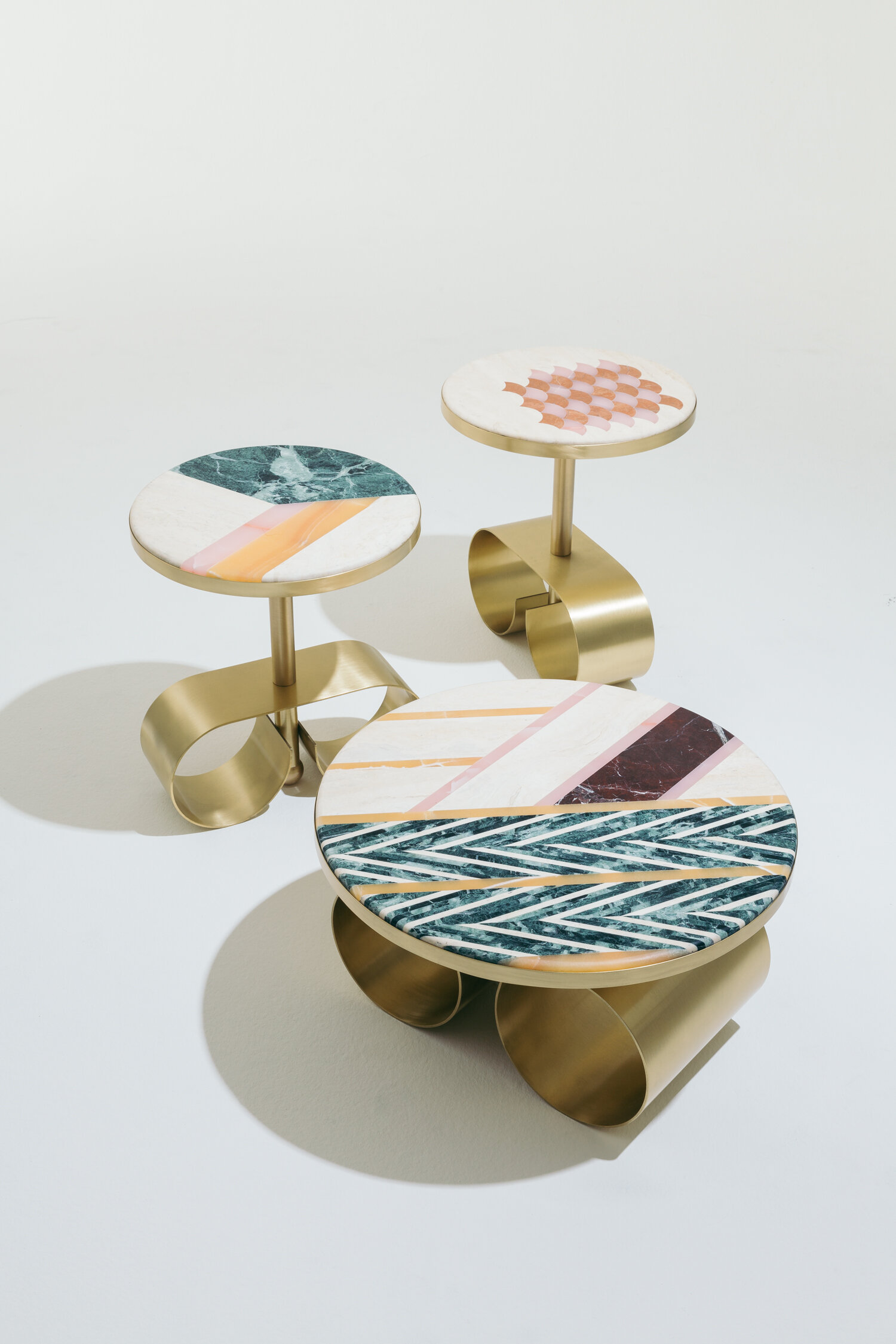
The Happy Room | Coffee table collection for Fendi at Design Miami 2016
Photo | Fendi
Alice | Lamp in marble and onyx for Budri
Photo | Mattia Balsamini
When starting a new project, how do you approach the brief?
CC: My design approach is always the same, what changes is the tone of voice. I always try to design something related to the client I am working for, in order to create a design collection or an interior that suits for it. The project starts with a deep research in the heritage of the client I am working for and in my inner passions: architecture, history of design, nature (as catalogue of colours and texture), jewellery (as function with right level of aesthetic), fashion (as research in colours, attitude).
Planetario | Vanity table
Photo | Alessandro Di Bon + Laura Pozzi
Planetario | Ottoman, from the interior project The Pink Closet boutique
Photo | Davide Lovatti
You have just recently completed a project with Palazzo Avino, a stunning hotel within a building that dates back to the 12th century. Can you tell us about the project and its concept?
The idea came by thinking about the essence of Palazzo Avino and its bond with Ravello and the Amalfi Coast. Perched on the steep cobblestone alleys, the hotel is like a pink mirage amidst terraces of olive and citrus trees. Hard to reach, it is a destination that proves to be even more extraordinary than expected, thanks to the breathtaking view of the sea and the horizon, glimpsed through the lancet windows in the facades of the Palazzo. The concept takes its cue from the wonders of the Italian gardens of Ravello, and the odyssey of forgotten legends of the Tyrrhenian Sea.
The light, the colours, the choice of materials are fundamental in my project to evoke this magic atmosphere. So, my project starts from a research on Palazzo Avino and its location in Ravello. The designed gardens of Villa Cimbrone and Villa Rufolo, the Moorish and classical influences, the history of Palazzo Sasso (now Palazzo Avino by the will of Mariella Avino), home of the nobility of the time, with its towering architecture and the façade perforated by a succession of pointed arches that look towards the sea - were the starting points of my research.
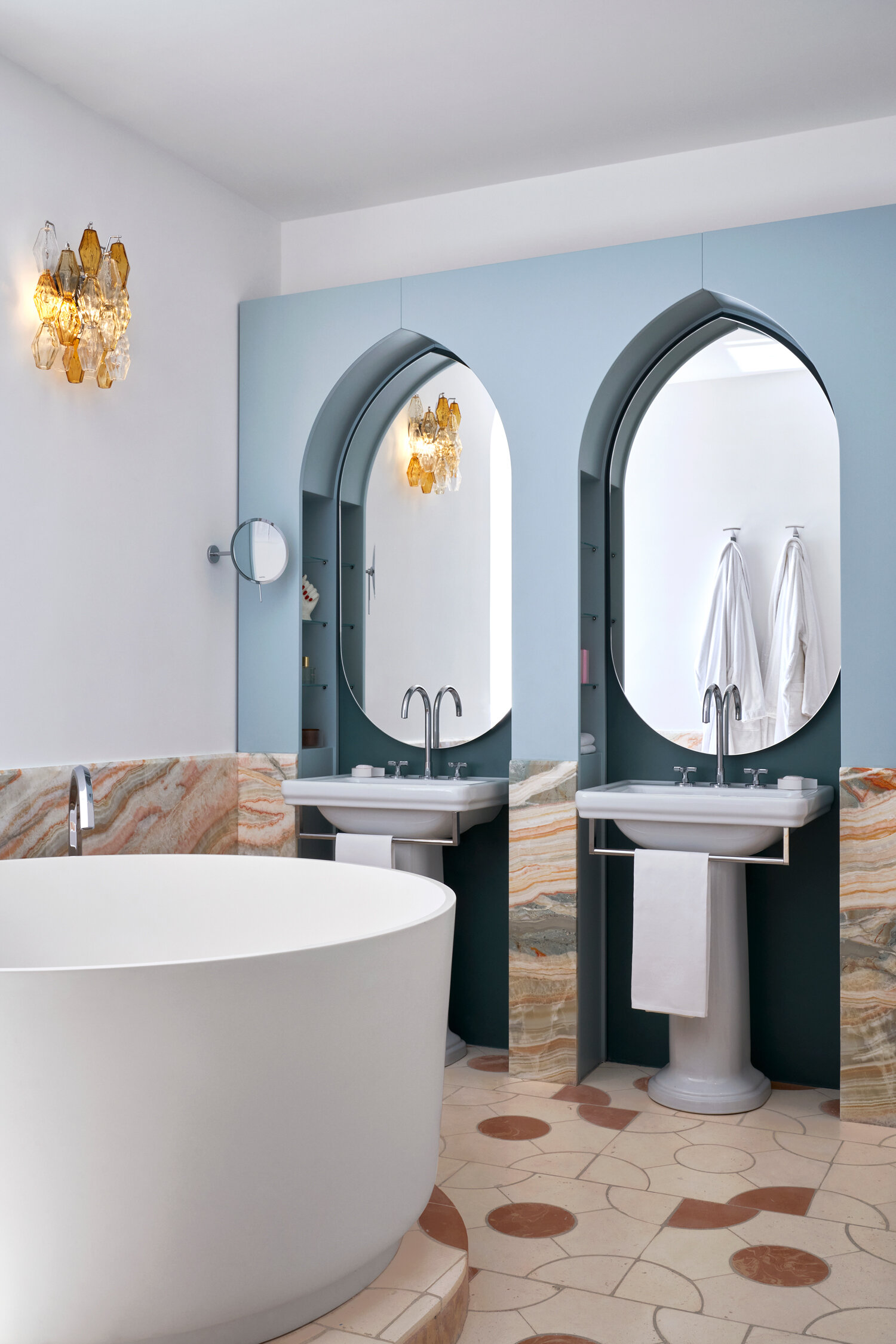
Palazzo Avino | Capsule collection of suites and rooms
Photo | Davide Lovatti
The distinctive features of my project are:
- Human made nature / artificial paradise: bringing inside the suggestions of the designed nature that characterizes the gardens of Ravello. I strongly wanted terracotta as flooring, which in my opinion represents the only cultured alternative to the traditional decorated ceramics of the local craftsmanship (which are overly used on the Amalfi Coast).
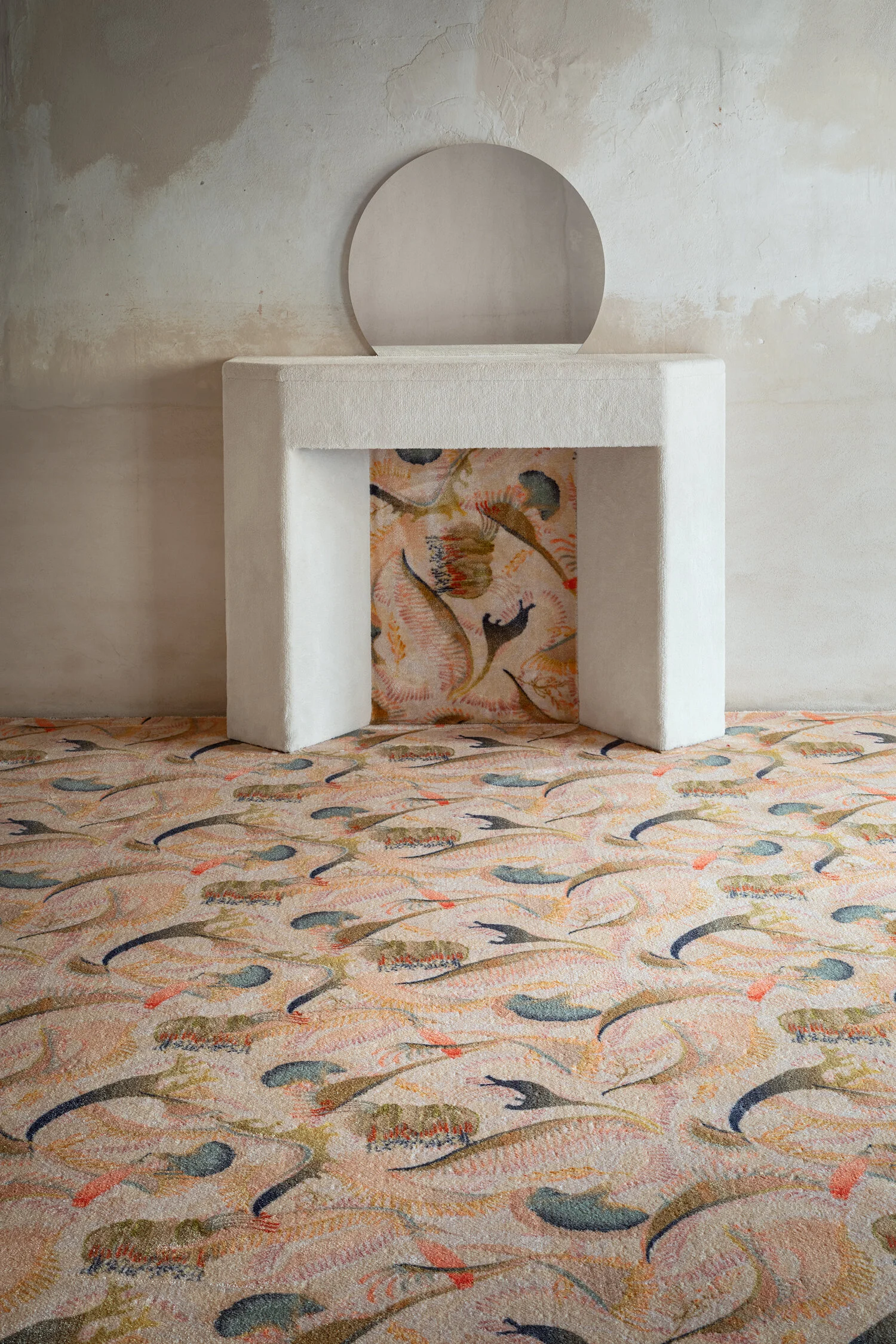
The floors are therefore in terracotta (also in the bathroom) which is a natural and Mediterranean material, applied here with a prevalence of white earth with details in pink, moka and variegated colours in the Boboli and Tivoli geometry inspired by the designs of the Italian Gardens (by Fornace Brioni).
- Inner garden: the charm of nature and of these graphic gardens enters in the project through textiles and in the bathroom through the use of natural patterned slab materials like onyx and marble (all by Budri).
- Architectural elements of the Palace: emphasised niches, portals, original terracotta balustrades, and pointed arches. In particular, in the bathrooms we have created furnishings that simulate pointed arches that enclose and give preciousness to the washbasin.
- Classical twist: that feeds on more sumptuous decorative elements, always treated in an unusual way e.g. use of coloured briars in furnishings with linear volumes, presence of some period furnishings, Venini Poliedri (also in ensuites bathrooms), large briar-edged mirrors, chairs with backrest medallion, and use of marble boiserie in the bathrooms.
All these elements mixed-up with pure geometrical shapes and items - like the bathtubs for example.
- Wunderkammer / mermaid refuge: mother-of-pearl and iridescent varnishes, ceramics with a crackle effect, handles and small details in brass castings with organic shapes of coral and shells, alcova structure that accommodate the beds, embossed headboards, antique and colored mirrors.
For the bathroom: they look like a precious alcova, wunderkammer for the self-care.
Palazzo Avino | Capsule collection of suites and rooms
Photo | Davide Lovatti
Palazzo Avino | Capsule collection of suites and rooms
Photo | Davide Lovatti
Palazzo Avino | Capsule collection of suites and rooms
Photo | Davide Lovatti
Palazzo Avino | Capsule collection of suites and rooms
Photo | Davide Lovatti
Throughout your projects and particularly your product lines, you have experimented and used a diverse range of materials. Is there a particular material that you haven’t yet explored and would like to use?
CC: I use every kind of material and every time I like to explore new materials in my projects. As I like to use ‘Design by Nature’ materials, I do use marbles for many different projects, both in interiors and in products. I also love to use cotto, which happens to be one of the materials that I know better, thanks to the collaboration with Fornace Brioni (I was engaged as creative director in 2016). Borosilicate glass is also another material I like to experiment with, I feel free to do it in particular with my own design brand Attico Design.
Olfatorrio | Glass Vase Collection, Attico Design
Photo | Mattia Balsamini
What are your studio must haves?
CC: Good light, a relaxing atmosphere that helps creativity, prototypes, and also some design pieces that I'm familiar with (since I’ve had them for a long time … such as the Tecno armchair by Gerli or my office table by Caccia Dominioni).
Who are some designers, artists or individuals that you most admire, and who have had some form of influence on your work?
CC: I got passionate, and I still am, about the work of Ettore Sottsass, Gino Sarfatti, Caccia Dominioni, to name just a few of them. I admire the ‘Great Masters’ who worked with the same competence and quality on architectures and interiors, as well as taking care of every single detail of the furniture. Among the others: Carlo Scarpa, Adolf Loos, Le Corbusier, to mention but a few.
What is the best advice that you have ever been given?
CC: Keep looking forward.
How would you describe yourself and your style in five words?
CC: Colourful, narrative, iconic, surprising, refined.
Cristina Celestino for Maison Matisse
Photo | Chiara Cadeddu
You have worked across a number of varied projects and collaborations ranging from Fornace Brioni, Fendi, BottegaNove, Budri and Sergio Rossi just to name a few. Is there a dream project that you have not yet realised?
CC: Yes, I have been lucky for having the possibility to work with many dreamy brands, and for me it is still a dream to work with some of them, such as Fornace Brioni, of which I follow the creative direction. As it is been an honour to work again with Fendi after the Design Miami in 2016, with the collection ‘Back Home’ I designed for Fendi and Fendi Casa last year. Dream project? I don't know – the best is yet to come ;)
Scenografica design | Cristina Celestino for Fornace Brioni
Photo | Mattia Balsamini
Scenografica design | Cristina Celestino for Fornace Brioni
Photo | Mattia Balsamini
Can you share with us any exciting upcoming projects?
CC: We have just presented in Paris my new collaboration with Maison Matisse, the second unlimited collection of the brand, made of product pieces inspired by the iconic painting by Henri Matisse ‘Intérieur aux aubergines’ (1911) and produced by the best Italian craft manufacturers. At the moment we are introducing the new collection ‘Amazonia’ I designed for Ames, a German-Colombian design brand. In this project the tropical theme is reinterpreted not just as a formal decorative pretext, but also as a tribute to the identity of Colombia, with its unique ecosystem. The reference develops through a western design approach, which does not set out to emphasise the ‘ethnic’ character of the artefacts, and takes its cue from the production of César Manrique at Lanzarote; it also attempts to trigger a subtle play between interiors and outdoor spaces, making greenery the central focus of the design theme. I have assigned these pieces that play with the colours and textures of natural materials the task of acting as messengers of the beauty and uniqueness of Colombian nature. The products are travelling surrogates of the flora of the Amazon, and will inhabit our interiors, reminding and speaking to us every day about the importance of plants and the force, freshness and lushness of the Amazon and I hope the importance of protecting it.
Intérieur aux aubergines | Collection for Maison Matisse.
Photo | Fabrice Gousset
Intérieur aux aubergines | Collection for Maison Matisse.
Photo | Fabrice Gousset
Intérieur aux aubergines | Collection for Maison Matisse.
Photo | Fabrice Gousset
Amazonia collection | Furniture and living accessories for Ames
Photo | amesgmbh - Andres Valbuena H
What is something that you like to collect?
CC: I am a very passionate collector of Italian design masterpieces, even rare, that I like to use in my home (and office). They are mainly all Italian design pieces from 50s to 70s and most of them are lamps. My favourite piece that I have is the lamp ‘Chiara’ by Mario Bellini for Flos from the 60s.
What are you reading at the moment?
CC: I've just started a monograph on the Brazilian Architect Lina Bo Bardi.
Which holiday destination are you dreaming of?
CC: Every place with sea and architectural gems to be discovered is my dream destination.
Can you share with us your favourite places in Milan to:
Shop: Navigli flea market
Art: Galleria Massimo de Carlo located at Casa Corbellini-Wassermann, situated in Viale Lombardia 17, which was built in the early 1930s by the renowned Italian architect Piero Portaluppi.
Visit: For a nice trip outside Milan, I warmly recommend to visit the fascinating Villa Litta in Lainate: a historic villa in the north of Milan, with its Grottone and Ninfeo is one of the most surprising and refined places of delights of Renaissance culture in Lombardia.
Dine: 28 posti – it is a restaurant of which I recently redesigned the interiors.
Secret Spot: Rather than secret I would define it as ‘my place’: Rotonda della Besana is always been one of my favourite spots in Milano, since I first arrived in the city. Its beauty and calm atmosphere is a peaceful place where to recover from the frenzy of the Salone.
Esotismi | Hand painted and hand-embroidered silk wall coverings collection for Misha Wallcoverings
Photo | Davide Lovatti
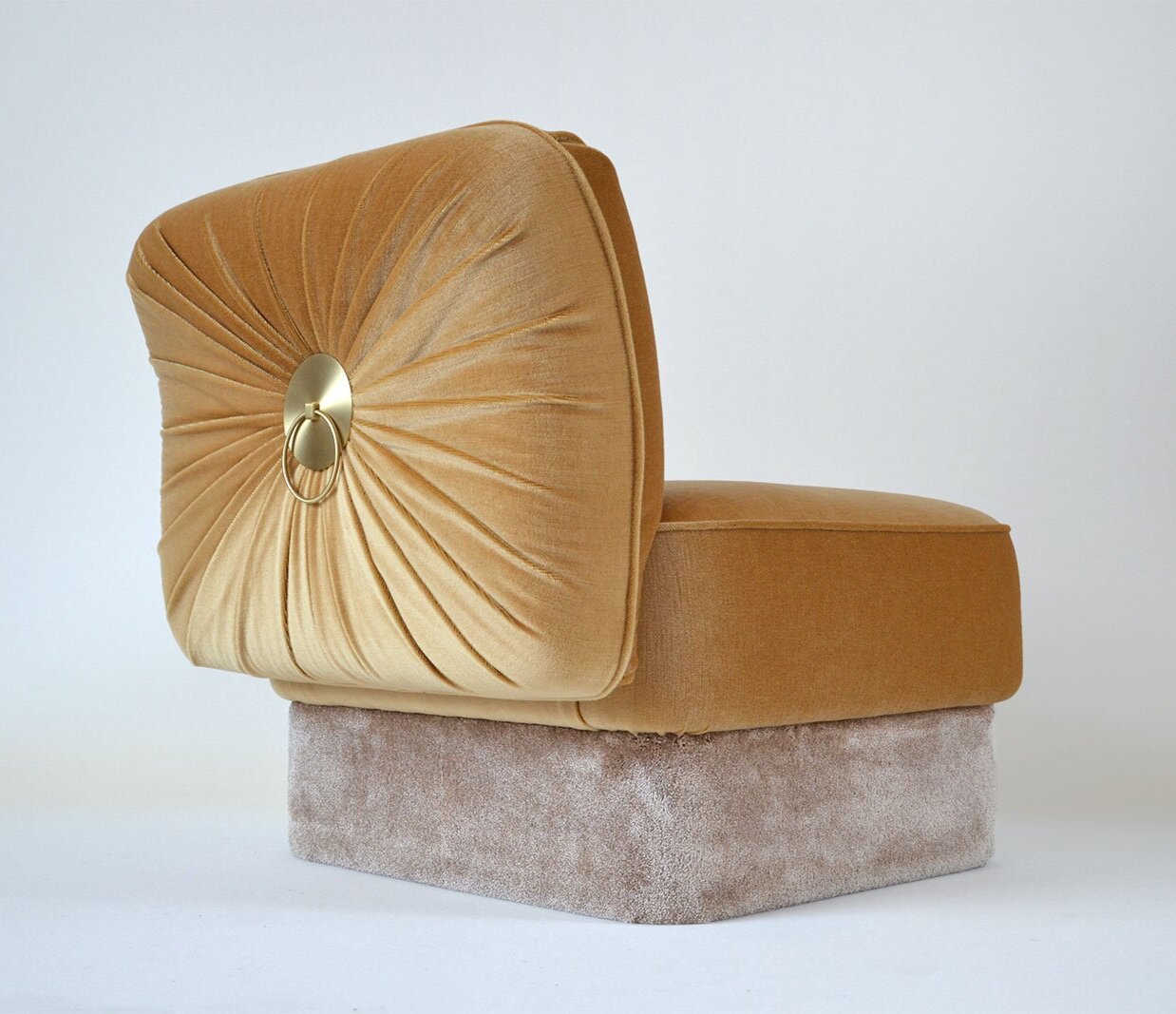
Powder Armchair | Attico Design
Photo | Cristina Celestino


