PAU BOUTIQUE
ESTUDIO DIIR
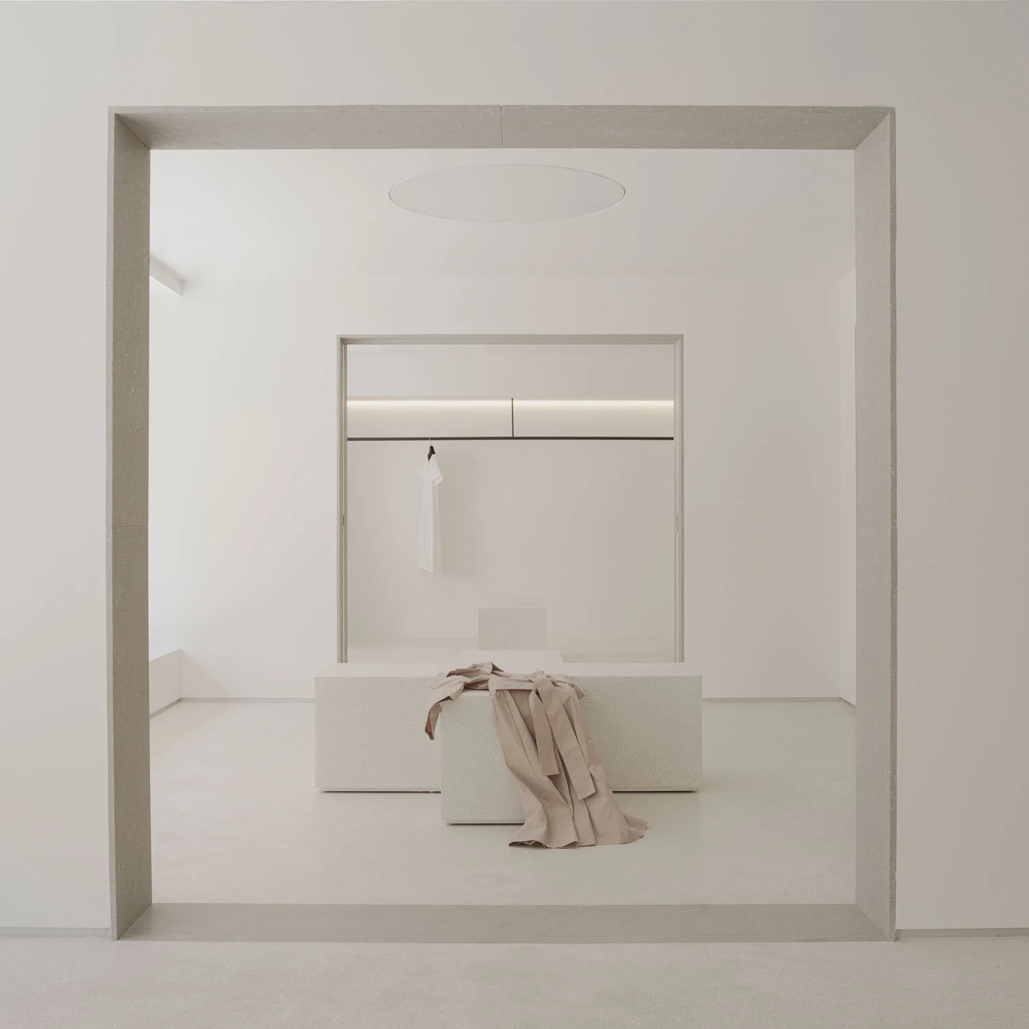
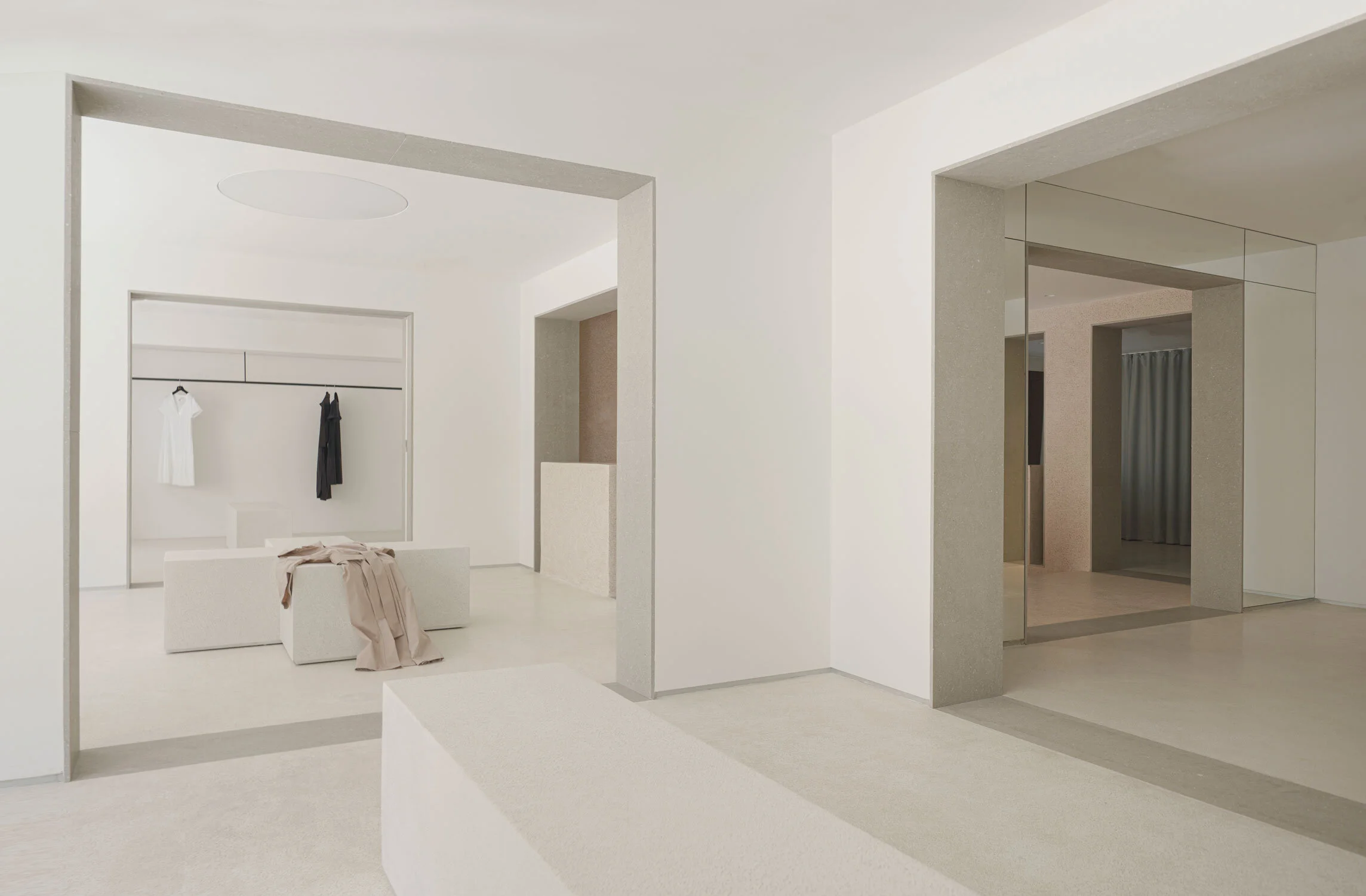
In the heart of Valencia, Spain a new boutique concept has been designed by Estudio DIIR for the flagship store PAU. Housed in a former Spanish palace from around the 18th to 19th century, this retail project has been designed in a sequencing format that takes place through a square grid blueprint. The floor plan has been defined in three by three rows of squares making nine perfect squares in total, creating a museum-like experience for its guests, as their movement is subtly guided by the concatenation of rooms.
This type of programme gives greater opportunities for the client to exercise how their merchandise is curated throughout the boutique, as it helps to define separate zones for various collections.
The interior aesthetics of the boutique have been treated in the same codes as that of museums, which follow a purist formality to allow the garments to distinctly be the focus of attention within the space. In this boutique, concrete and light peach coloured sand-like terrazzo finishes have been liberally applied across the walls and floors of the space. Mirrors have also been applied to the walls to accentuate this minimalist expression in the spatiality, as well as linen curtains which softly add to the flow of the space.
At the centre of the grid is the nexus of this exhibition space where the monumental staircase leading up to the second floor is positioned. It is also here in the centre where the interconnection between all the exhibition spaces in the gridded floor plan takes place.
The strong use of geometry is a key thematic component for the design of this boutique, which is present in not just the architectural layout of the space, but also exists as part of the design. The use of geometric shapes have been incorporated into each of the exhibition rooms in the form of a rectangle, cross, square and circular objects that have been designed to function as both display units for the garments, and can dually be used as seating within the gallery for clients. Materially they have been constructed using local Valencian stone.
In the centre of the boutique, a circular niche lacquered in red has been integrated within the side profile of the staircase to serve as another display unit. This also acts as one of the focal points in the space as the red is quite striking amongst a purist setting where there is an absence of any competing colours.
Within this 200 m2 boutique, Estudio DIIR have manifested a unique retail experience that invites us to reflect on new sales codes, and proposes a shopping experience that is based on rotundity and material quality of its environment.
PHOTOGRAPHY | DAVID ZARZOSO


